
How to Build Stronger Contrast in Your Drawings.
Share
Hi there! I’m Luke Lewis, founder of Luke’s Fine Arts—where I help passionate young artists take their drawing skills to the next level through detailed techniques and intentional practice.
Have you ever looked at a drawing and felt like it jumped off the page? That one sketch that somehow had more impact, more depth, more life than all the others? What if I told you that the secret behind that kind of visual power isn’t just talent—it’s contrast?
Contrast is what gives your drawings clarity, dimension, and focus. It’s what makes certain parts of your work leap forward while others subtly fade into the background. But here’s the thing: contrast isn’t just black and white—it’s a dance between extremes, and learning to master it will absolutely transform your art.
So ask yourself: Are your drawings making the most of contrast? Are your focal points strong enough? Are you guiding the viewer’s eye where you want it to go?
Whether you’re brand new to this idea or looking to refine what you already know, this post will give you the tools, understanding, and practical steps to build stronger contrast and take control of your compositions.
What Will You Learn?
Here’s what you’ll take away from this post:
-
How contrast helps guide the viewer's eye and create focal points
-
Why strong darks and lights add depth and make your artwork pop
-
The difference between high and low contrast—and when to use each one
-
Examples of how legendary artists like Caravaggio and Rembrandt used contrast to masterful effect
-
A fun, easy gradient exercise to help you control tones and transitions
Before we dive into the how, let’s first explore the why—because understanding why contrast matters is the first step to using it with confidence.
Why Contrast is One of the Most Powerful Tools in Art
Let’s zoom out for a moment and talk about the big picture.
Contrast isn’t just a technical element—it’s storytelling with tone. It’s what gives your drawing purpose. It shapes where the viewer looks, how they feel, and what they remember.
Imagine a spotlight on a stage. The moment that light hits a figure, our eyes snap to it. That’s what contrast does in your artwork. It highlights the parts that matter most and creates space around them for context. Without contrast, drawings feel flat or confusing. With it, they feel alive, intentional, and clear.
By deliberately placing dark tones next to light ones, you create visual tension and interest. It’s not just about making things darker or lighter—it’s about creating relationships between tones. Think of contrast like rhythm in music. It gives your work flow, emphasis, and structure.
Use it well, and your viewer won’t just look at your drawing—they’ll feel it.
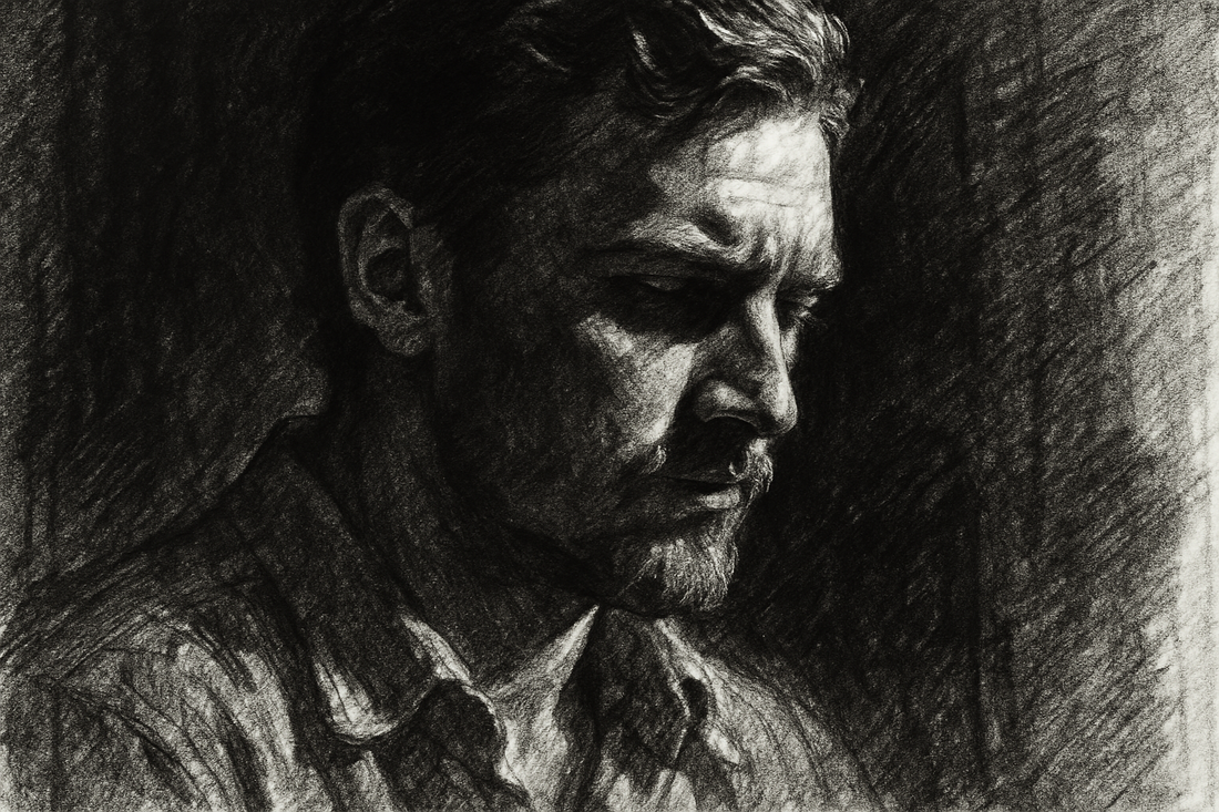
How Light and Dark Make Your Drawings Pop
Here’s a truth you might not have thought about: graphite and charcoal stand out because the paper is white.
That crisp white surface acts as a natural high-contrast backdrop. The darker your mark, the more it stands out. This is why shadows, outlines, and depth start to form the moment you place pencil to paper. It’s not just a technical trick—it’s physics and perception working together.
The same applies in reverse: when you draw on black paper, a white subject—like a white cat or misty clouds—suddenly becomes luminous. Your light tones glow against the dark, and the contrast immediately captures the viewer’s attention.
This is what makes contrast such a powerful tool—it’s built into the very act of drawing. All you need to do is learn how to use it deliberately.
Bottom line? Whether you're working in charcoal on white paper or using white pastel on black, contrast is your ally. Use it to control mood, form, and focus—and watch your drawings come alive.
When to Use High and Low Contrast
Let’s talk strategy.
High contrast is bold. It demands attention. By using strong differences between light and dark, you create impact that’s immediate. Think of it like turning the volume up in your artwork—it adds drama, energy, and clarity. It’s perfect for focal points, dynamic compositions, or areas where you want emotion to hit hard. High contrast is what grabs the eye and says, “Look here.”
Low contrast, on the other hand, is subtle and soft. It helps you shape quieter moments, like backgrounds or soft shadows. These gentle tonal transitions allow areas to blend and recede. It’s your chance to create atmosphere without overwhelming the viewer. Use low contrast to let things breathe—to add balance, distance, or serenity.
Knowing when to lean into high or low contrast gives you compositional control. It’s not just about style—it’s about storytelling. So next time you plan a drawing, ask yourself: Where do I want attention? Where do I want peace?
Contrast isn’t just a technique—it’s a choice. Use it like a director frames a shot in film: to highlight, to soften, to lead.
How Famous Artists Used Contrast to Master Their Craft
Some of the greatest artists in history understood contrast not just as a visual tool, but as an emotional one. They didn’t just draw or paint—they directed the viewer’s experience using light and shadow. Let’s take a look at how four legends used contrast in completely different ways:
Caravaggio
Michelangelo Merisi da Caravaggio was a 17th-century Italian painter known for his dramatic use of chiaroscuro—the bold contrast between light and dark. His figures often seem to emerge from complete darkness, caught in a moment of raw emotion. Caravaggio didn’t just use light to illuminate; he used it to shock, to highlight conflict, and to heighten drama. Whether it was a hand raised in violence or a quiet expression of pain, his lighting choices made every moment feel intense and alive.
Rembrandt
Rembrandt van Rijn was a Dutch master of portraits and storytelling through subtlety. He didn’t rely on extreme contrast, but rather gentle transitions between tone and light. His shadows whispered instead of shouted. In works like The Night Watch and his many self-portraits, he used soft, golden light to emphasise depth and texture. Rembrandt’s contrast wasn’t loud—it was emotional. It made his subjects feel introspective, real, and deeply human.
Goya
Francisco Goya, a Spanish painter of the late 18th and early 19th centuries, is often remembered for his darker, more psychological work. In his later years, Goya embraced high contrast to reveal horror, fear, and truth—especially in his Black Paintings series. His dramatic contrasts helped to express his inner world and comment on the madness he saw around him. His contrast wasn’t about beauty—it was about honesty. Goya used darkness not just to shade a scene, but to shake the viewer awake.
Vermeer
Johannes Vermeer, another Dutch painter, was known for his peaceful domestic scenes and soft, natural lighting. While his contrast wasn’t as extreme as Caravaggio’s, he used it masterfully to bring focus and serenity to his compositions. In Girl with a Pearl Earring, the glowing highlights on her face and jewellery stand out just enough from the deep background to captivate. Vermeer’s contrast was gentle, precise, and perfectly balanced—bringing calm, clarity, and beauty into everyday moments.
These artists show us that contrast is flexible—it can be loud or quiet, emotional or formal. The key is to use it with intent.
Challenge: Try This Gradient Exercise to Master Contrast
One of my favourite ways to teach contrast to my students is through gradient exercises. They’re simple, meditative, and surprisingly revealing. I often use them at the start of class—not just to warm up, but to set the tone for how we’ll think about value and tone throughout our drawings.
I’ll gather the group, and we all take out two pencils—maybe a soft 6B and a hard 2H—and slowly blend one into the other. No rushing. No skipping steps. It’s about learning how to control pressure, layering, and transitions. This small practice trains your hand and your eye to see tone more clearly.
Here’s how you can try it at home:
-
Pick Your Colours
Start with something bold like black and white, or dark blue and yellow. You can use pencil, pastel, or even paint. -
Create a Smooth Gradient
Begin with your darker tone and gradually transition to the light one. Focus on making the shift as seamless as possible. -
Play With the Contrast
Add sharp breaks or soft blends in places. This helps you understand how contrast feels and how it changes mood. -
Blend Your Edges
Use a blending stump, tissue, or brush to smooth out lines and create a natural transition. -
Experiment Across the Page
Try gradients in different directions or across shapes. Mix tones to see how contrast changes based on form and texture.
This kind of repetition might seem simple, but it’s one of the most powerful ways to improve control and develop a feel for contrast.
Key Takeaways
-
Contrast guides the eye
Use light and dark to lead viewers exactly where you want them to look. -
Make your drawings pop
Strong contrast brings your work to life with energy and depth. -
Use high and low contrast strategically
High contrast grabs attention. Low contrast brings calm. Know when to use each. -
Learn from the greats
Artists like Caravaggio, Rembrandt, Goya, and Vermeer show how versatile and expressive contrast can be. -
Practise with purpose
Exercises like gradients help you understand tone and build your skill over time. -
Be intentional
Great contrast isn’t an accident. Think about where you want impact—and then make it happen.
Thanks so much for reading! I hope you’re feeling inspired to explore contrast in new ways and add more punch, emotion, and clarity to your drawings.
Now it’s your turn—grab your pencil or brush and create something that plays with the extremes. And when you’re done, snap a photo and share it on Instagram with #StrongContrastArt. I’d love to see what you come up with.
Happy drawing, and much love,
Luke Lewis
Artist & Art Teacher
Founder of Luke’s Fine Arts
🌐 lukesfinearts.com.au
📞 0405 268 796
📍 Perth, Western Australia
📸 Instagram: @LukesFineArts