
The difference between using coloured pencils and graphite pencils! a full breakdown.
Share
Hey and welcome to my blog! My name is Luke Lewis, and I run an art business called Lukesfinearts! If you’ve been sketching in graphite and are curious about stepping into colour, I totally get it — I was in the same boat.
When I first started using graphite pencils, something strange and wonderful happened — I started seeing the world differently. Not in some abstract, artsy way, but literally. I’d be walking down the street or making a cup of tea, and suddenly I’d notice shadows curling across the table, light slipping between tree branches, and the soft shifts in tone where sunlight met shade. Graphite sharpened my vision for shape, light, and form.
Then, when I finally picked up coloured pencils, the change was even more powerful. Suddenly, the world wasn’t just shapes and shadows — it was alive with vibrant tones. I noticed how warm sunlight had a golden-orange glow in the morning, how cool blues snuck into shadows, and how skin was never just “skin-coloured” but a shifting patchwork of reds, browns, purples, and soft peach. It was like someone had turned up the saturation on life itself.
That’s the magic of coloured pencils. They don’t just add colour to your drawings — they change the way you see the world. Every leaf, every building, every face becomes a palette waiting to be explored. Once you learn how to use them, you’ll never look at the world the same way again.
Let’s give your drawings that extra spark, one pencil stroke at a time.
What you’ll learn today
Here’s what you’ll take away from this post:
-
The key difference between coloured pencils and graphite when layering
-
Why coloured pencils need more pressure, patience, and layering in colour
-
Simple burnishing tricks for smooth finishes
-
A go-to colour palette perfect for realistic drawings like skin and nature
-
Step-by-step guide to drawing lifelike skin tones with warm and cool colours
-
How to build slowly and get results that actually look real
Beginner’s art terms glossary
-
Burnishing — pressing firmly with a pencil to completely fill the texture of the paper, creating a smooth, polished surface.
-
Layering — applying colour in multiple thin coats so they build depth gradually instead of all at once.
-
Lightfastness — a measure of how well a pigment resists fading when exposed to light over time.
-
Tooth (of paper) — the texture or roughness of paper that holds pigment; more tooth = more grip for layers.
-
Wax bloom — a cloudy film that can appear on wax-based coloured pencil drawings after heavy layering or burnishing.
-
Pigment — the coloured material in the pencil that gives it its hue and intensity.
-
Palette — the specific colours you choose for a piece of artwork.
-
Mid-tone — a colour that sits between the lightest and darkest areas, used to transition smoothly between them.
What’s the difference between coloured pencils and graphite in terms of layering?
Layering with graphite is all about patience and subtle shifts. You build up tone slowly, letting each layer settle before adding the next. It gives you control, smooth transitions, and that classic soft look we all love. Blending is buttery and predictable, which makes it feel safe — like you’re sculpting with shadows.
Both graphite and coloured pencils are slow mediums. They reward patience, repetition, and a careful hand. Neither gives instant results — they’re all about the journey of watching your work slowly come to life.
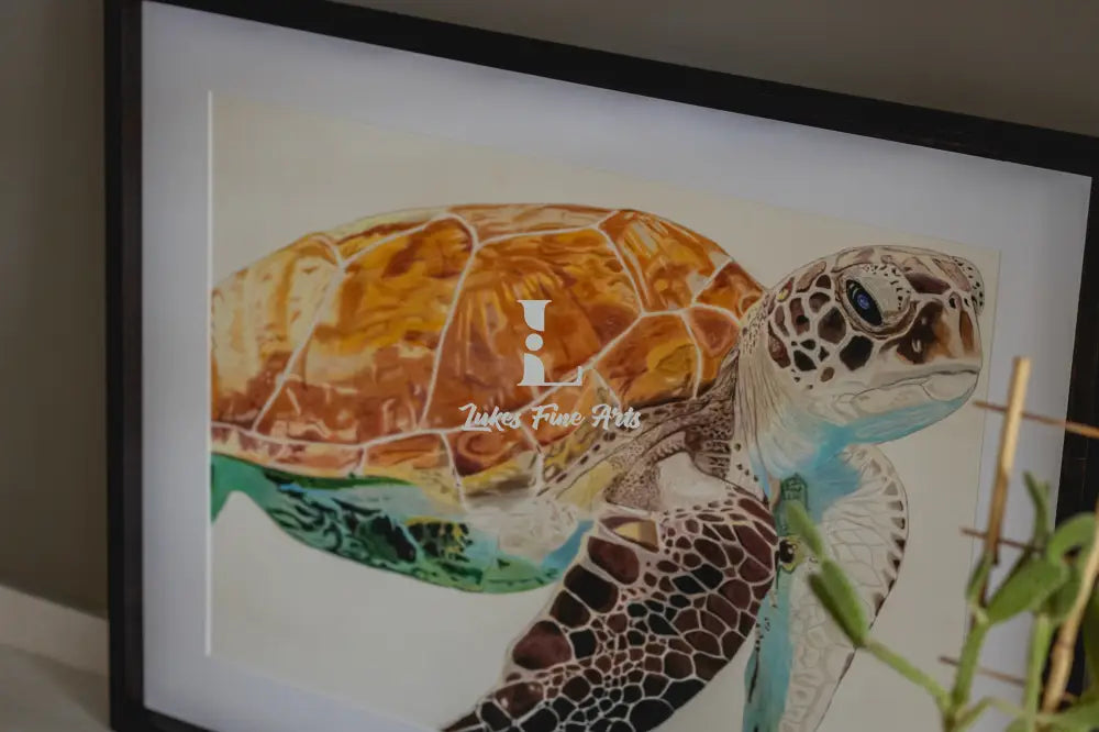
But with coloured pencils, there’s a unique twist: you’re not just building value (light to dark) — you’re stacking colour on colour. You might start with a soft peach, then add a layer of burnt sienna, then a touch of ultramarine, and somehow, they combine into something richer and deeper than any single pencil on its own.
Not all pencils behave the same way:
-
Prismacolor pencils are wax-based, soft, and incredibly rich in pigment, which makes them amazing for smooth, vibrant layers — though they can be harder to get fine detail with.
-
Faber-Castell Polychromos are oil-based and keep a sharper point longer, perfect for detailed work like hair or intricate textures.
-
Caran d’Ache Luminance are high-end pencils that combine rich colour and the ability to hold detail, with superb lightfastness.
With coloured pencils, you can layer on layer on layer — sometimes 20 or more — and each brand’s formula affects how those layers build and interact.
Why quality matters with coloured pencils
With graphite pencils, quality matters, but you can get away with mid-range pencils and still create excellent results. With coloured pencils, however, quality makes a huge difference — in both your experience and your final art.
Artist-grade coloured pencils have higher-quality pigments, meaning the colours are richer, blend better, and are more lightfast (resistant to fading over time). They also have stronger, more consistent cores, so you don’t deal with constant breakage when sharpening.
Cheaper pencils often have weaker pigment, meaning you need more layers to get the same vibrancy — and sometimes you just can’t get there at all. They may also be scratchy, waxy without blending well, or brittle inside, making fine work frustrating.
If you’re serious about realistic art, think of pencils as an investment in your skills. You don’t need a giant set at first, but you’ll thank yourself later for choosing brands that perform well and last.
Tips for burnishing and shading with coloured pencils
Burnishing (sometimes mistaken for blending) is when you press firmly enough with a pencil to fill the paper’s tooth, creating a smooth, paint-like finish. Unlike blending graphite, which can be done with a stump or tissue, coloured pencil blending is all about layering until the pigment completely covers the paper’s texture.
Here’s what helped me most when switching from graphite:
-
Light pressure goes a long way — Start with a soft touch and build up. You can always burnish later, but you can’t undo too-heavy strokes without damaging the paper.
-
Layer your colours, don’t rush it — Multiple layers of light colours create smoother transitions before you add darker shades. This avoids harsh edges and patchy areas.
-
Use circular motions — Tiny, consistent circles help hide strokes and create an even layer.
-
Use a blending pencil or tool — Colourless blenders or burnishing pencils can smooth colours together without overworking the pigment.
-
Don’t forget white and light tones — These are brilliant for soft highlights and subtle blending, toning down overly intense colours.
-
Work on good paper — With coloured pencils, paper choice matters more than you might think. Some artists love lots of tooth for more layers, while others prefer smoother paper for fine detail. Experiment until you find your perfect surface.
The colour palette you need to nail realism art
Getting started with coloured pencils doesn’t mean buying every shade under the Aussie sun. A carefully chosen small palette can take you a long way, especially for realistic subjects like skin, plants, and still life.
Starter realism palette:
-
Burnt Sienna
-
Raw Umber
-
Light Peach or Light Flesh
-
Crimson Red or Dark Red
-
Ultramarine Blue
-
Indigo Blue
-
Olive Green or Moss Green
-
Cream or Light Ivory
-
Black (use sparingly)
-
White
💡 Tip: Before committing to a big set, buy a small set from a few different brands and try simple projects like butterflies or flowers. They’re easier to tackle, use fewer colours, and help you feel how each pencil behaves. Once you know which brand suits your style, you can invest in a larger set or add individual colours.
More isn’t always better
Extra colours can be tempting, but a huge set can sometimes overwhelm you with too many options. You might spend more time deciding which pencil to pick than actually drawing. Starting with a smaller palette forces you to get creative, learning how to layer and mix to create the shades you need.
As you grow in confidence, you’ll naturally learn which colours you reach for most — and which you can skip. Slowly expanding your palette means each new colour has a clear purpose, and you’ll know exactly how to use it.
Easy guide to burnishing skin tones with coloured pencils
Step 1: Choose your base tone
Pick a soft neutral like ivory, beige, or light peach. Use gentle, even strokes to fill the skin area lightly, keeping your pencil sharp. The goal here is a smooth, even foundation — think of it like priming a canvas.
Step 2: Map out your lights and darks
Lightly sketch in shadows and highlights before adding depth. This road map helps you keep form consistent. Shadows are often softer and more colourful than you expect — avoid making them pure grey.
Step 3: Layer in warm tones
Add reds, light browns, and a hint of orange to cheeks, nose, and lips. Keep pressure light so the paper’s tooth can still take more pigment later. Warm tones bring life to skin and stop it from looking flat.
Step 4: Balance with cool tones
Introduce subtle blues, purples, or greys to areas like under the chin or around the eyes. This contrast against warm areas adds realism and depth. Cool tones also help create the illusion of soft, natural shadow.
Step 5: Burnish and smooth transitions
Once you’ve built several light layers, use mid-tones like peach, light umber, or cream to burnish areas together. This fills the paper’s tooth, locking colours in and creating a natural skin texture.
Step 6: Add fine details and refine
Sharpen your pencils and add freckles, pores, or fine wrinkles lightly. Play with different papers — some artists prefer lots of tooth for more layering, others prefer smoother paper for cleaner details. This choice can change the whole feel of your portrait.
Key takeaways
-
Start small and build slow
-
Layer with purpose
-
Burnish for smoothness
-
Mix warm and cool tones
-
Use quality paper
-
Take your time — realism is built one layer at a time