
The Power of Negative Space in Drawing: How to Use It to Improve Composition
Share
Want cleaner, more realistic drawings without piling on detail? Mastering negative space—those “empty” areas around your subject—can sharpen composition, boost realism, and guide the eye. Here’s a simple, practical guide you can use today.
Hi there! I’m Luke Lewis, founder of Luke’s Fine Arts – I help passionate artists level up their drawing through focused practise and techniques that actually work.
Have you ever looked at a drawing and felt like something was off—like it wasn’t breathing? The fix often isn’t more detail. It’s space. Negative space is how you create balance, rhythm and clarity without clutter.
Seeing beyond the lines: How negative space shapes stronger compositions
Negative space isn’t just “the blank bits”—it’s the frame that makes your subject sing. It guides attention, balances busy areas, and adds contrast without extra detail. Used well, it’s the quiet pause that lets your drawing speak louder.
A quick story from my sketchbook:
The penny dropped for me during a portrait study years ago. I kept polishing eyelashes, pores, tiny flyaway hairs—yet it looked less real. On a hunch, I softened the edges around the cheek and left the background airy and unresolved. Suddenly, the face lifted forward. The softness and “blurry” sections didn’t kill realism—they created it. From then on, I stopped trying to render every molecule and started composing with silence as much as with graphite.
Mastering balance with negative space
Before you chase micro-details, start by arranging space. Your first steps are about seeing and planning: notice the shapes around your subject, decide what to leave quiet, and map those areas early. This matters because composition—not eyelashes—decides whether a drawing lands.
-
Notice the shapes around and between your subject, not just the subject itself.
Training your eye to see “in-between” shapes improves proportion and spacing instantly. When you draw the gaps, angles and silhouettes accurately, the subject locks into place. It’s a reliable way to correct awkward tangents and tighten the overall design. -
Let empty areas breathe so your drawing doesn’t feel crowded.
Open space creates visual rest, which makes your detailed areas feel richer by contrast. Without breathing room, everything competes for attention and the viewer tires quickly. Strategic emptiness gives your focal point the stage it deserves. -
Rotate your page or change your viewing angle to spot new shapes.
A quick rotation breaks habitual seeing and reveals lopsided spacing or accidental mergers. You’ll catch weird alignments and tilts you’d miss head-on. This small habit lifts accuracy and balance without reworking entire sections. -
Use negative space to guide the viewer’s eye naturally.
Place open areas like stepping stones that lead towards the focal point. When the spaces flow, the eye flows. You’ll reduce visual friction and create that “effortless” look where the viewer arrives at the subject without feeling pushed. -
Simplify backgrounds so your main subject stands out clearly.
A pared-back background prevents detail overload and keeps the hierarchy clean. Soft gradients, large shapes and subtle value shifts push attention forward. The result: a stronger read from across the room—and on a tiny phone screen.
How artists use negative space to bring drawings to life
Think of negative space as your backstage crew: invisible when it’s working, essential for a polished performance. Artists use it to add drama, direct attention and keep the whole piece from collapsing under detail.
-
Leave bold, open areas so the subject lands with impact.
Big, quiet shapes act like spotlights. They create contrast and clarity, helping the subject pop at first glance. This is the difference between a “busy sketch” and a confident, gallery-ready statement. -
Use the shapes between figures to suggest movement and energy.
Interlocking gaps can imply gesture and rhythm. When the spaces feel dynamic, the forms feel dynamic—even if the rendering is minimal. It’s a powerful shortcut to life and momentum. -
Create silhouettes that rely on surrounding space for definition.
Strong edges read clearly in any lighting. When the outline is designed against clean space, the form remains legible without heavy shading. Silhouette thinking also helps you avoid fussy outlines that make drawings feel stiff. -
Balance busy, detailed sections with large, calm spaces to rest the eye.
This contrast controls pacing: detailed passages engage, calm zones recover attention. Without rest areas, detail loses value. With them, your focal textures feel luxurious rather than loud. -
Frame the subject with contrasting empty areas for drama and focus.
A light halo around a dark subject—or vice versa—creates instant emphasis. The viewer reads the centre first and stays longer. It’s a simple compositional nudge that feels natural, not forced. -
Let the background interact playfully with the subject’s outline.
Shaping the background to echo or counter the subject’s contour adds cohesion. Subtle “push–pull” along edges suggests depth without over-shading, keeping your forms lively and dimensional.
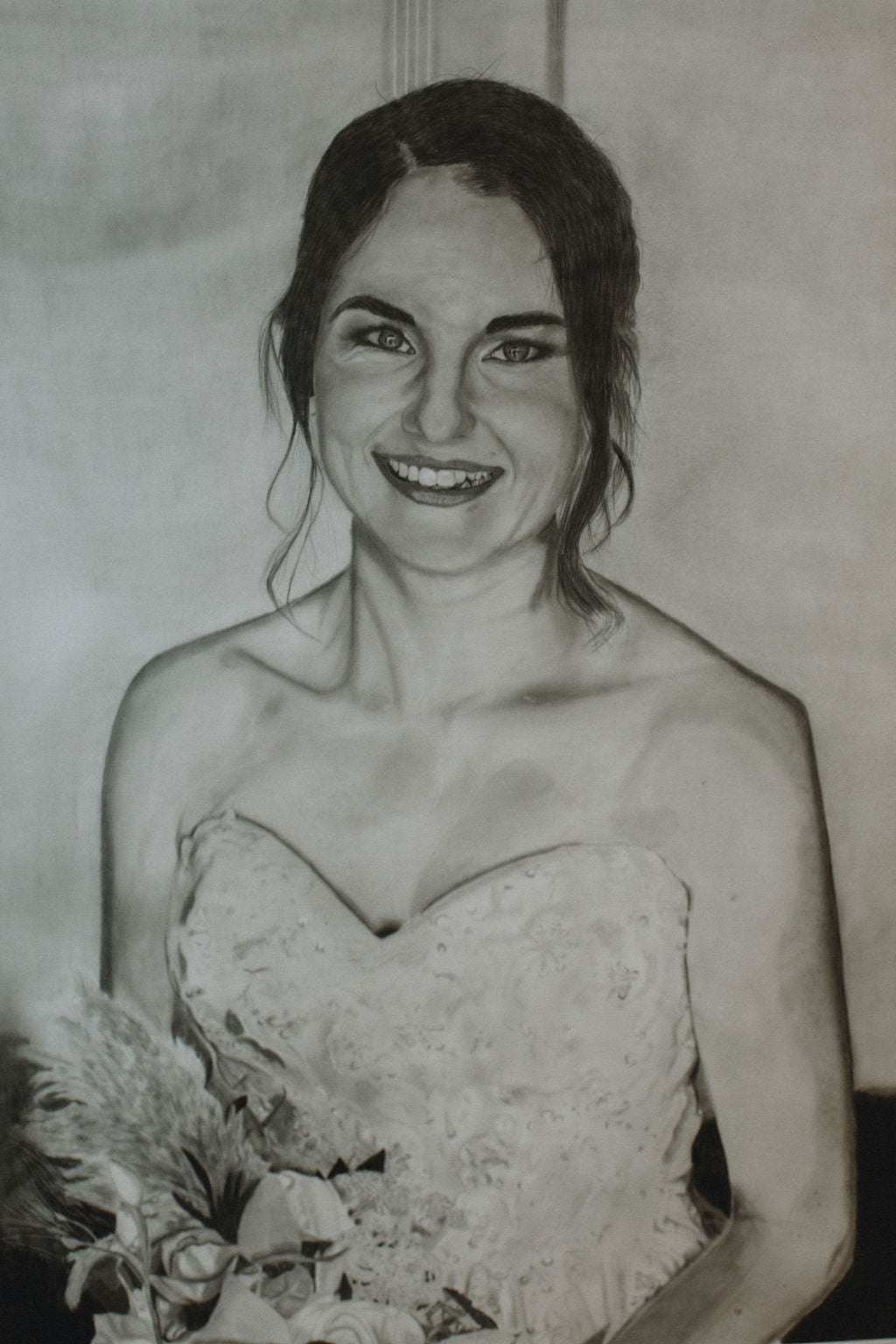
How I used this in my wedding portraits:
When I drew my family’s wedding portraits, I resisted the urge to polish every petal and hair. I kept the backgrounds soft, allowed the veil to fade into gentle tone, and simplified the suit details into larger shapes. The faces—where I wanted attention—breathed. Those deliberate open spaces made the portraits feel intimate and real, not overworked.
Step-by-step guide to drawing with negative space
Here’s a practical workflow you can repeat, from thumbnail to finish.
-
Start with a negative-shape thumbnail.
Set a five–ten minute timer and sketch only the spaces around your subject. No features—just the gaps. This locks in silhouette, proportion and spacing before you’re emotionally attached to details. -
Map large empty areas early.
Lightly block in where the background will stay quiet or soft. Indicate major value masses with simple shading or arrows. Planning silence first prevents you from cramming detail into areas that should stay calm. -
Establish value contrast in the space, not just on the subject.
Decide: is the subject lighter against a darker field, or darker against light? Lay in that backdrop value sooner than later. A clear figure–ground read makes everything easier—and stops you from “saving” a weak composition with detail. -
Vary the size and shape of negative spaces for rhythm.
Mix large, medium and small gaps. Repetition with slight variation creates flow; identical spaces feel mechanical. Squint to check whether your spacing forms a pleasing pattern independent of the subject. -
Balance edges: sharp where you want focus, soft where you want air.
Let some contours melt into the background and keep key edges crisp. This edge hierarchy guides attention better than micro-detail and adds realism by mimicking how cameras and eyes actually see. -
Practise with simple objects before complex scenes.
Try a mug, a shoe, or a leaf under strong light. Nail the surrounding shapes and silhouette first, then add only essential detail. Photograph your drawing and check the small thumbnail—does the read still hold?
Key takeaways
-
Composition first, detail second. Negative space frames your subject, creates balance and boosts realism without extra rendering.
-
Train your eye on “in-between” shapes. Drawing gaps and silhouettes fixes proportion and spacing quickly.
-
Let space breathe. Open areas provide rest, making detailed passages feel richer and more intentional.
-
Rotate to reveal issues. A quick page turn exposes crooked spacing and tangents you’d otherwise miss.
-
Guide the eye with space. Arrange quiet zones like stepping stones towards your focal point.
-
Simplify backgrounds. Fewer background details = cleaner hierarchy and a stronger read from any distance.
-
Use bold open fields for impact. Big, quiet shapes act like spotlights for your subject.
-
Design silhouettes. Clear figure–ground reads beat heavy shading for legibility and punch.
-
Counter busy with calm. Detailed clusters need large, simple spaces for pacing and rest.
-
Frame with contrast. Light-against-dark (or vice versa) creates instant, natural emphasis.
-
Shape the background deliberately. Let it echo or counter your outline to add depth and cohesion.
-
Work a repeatable process. Negative-shape thumbnails → map quiet areas → set figure–ground contrast → vary spaces → control edges → practise on simple forms.
-
Soft edges aren’t “unfinished”. Blurry sections often create realism by matching how we actually perceive focus.
-
Personal proof. My wedding portraits came alive when I simplified backgrounds and let faces breathe—less polish, more presence.
Challenge
Pick a subject and make a negative-space thumbnail first. Keep the background simple, design your silhouette, and choose one edge to soften deliberately. Post your result and tag @lukesfinearts—I’d love to see how your space makes the subject shine.
Thanks for reading! I hope this nudges you to design with space, not just detail. Grab your sketchbook, plan the quiet areas early, and let the drawing breathe. You’ll feel the difference immediately.
Happy drawing,
Luke Lewis
Artist & Art Teacher
Founder of Luke’s Fine Arts
www.lukesfinearts.com.au
0405 268 796
Perth, Western Australia
Instagram: @lukesfinearts